Free Worldwide Delivery

Secure payment
Free Worldwide Delivery
Secure payment

Price Promise

Friendly Support
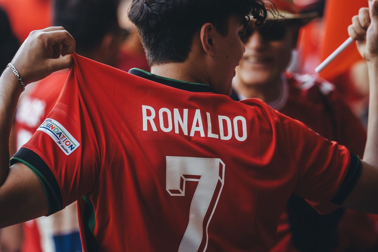
Football shirts are about much more than badges and colours. Ask most fans to think about iconic football shirts and they will usually picture the sponsor across the chest before anything else. That bold logo in the middle of the shirt is like a shortcut to a time, a place and a feeling.
Summer makes this even clearer. Big tournaments, pre-season tours and long evenings in pub gardens are full of classic kits. You spot an old shirt across the room and you know it right away from the sponsor, even before you clock the club crest. The sponsor is not just an advert; it is a memory.
Over the years, shirt sponsors have moved from simple branding to symbols of whole eras. Old electronics brands, classic beer names, early tech companies , they each mark a chapter in football history. It is not only the logo either; it is the font, the colour, the way it sits on the fabric. That is what turned football shirts into fashion pieces that people wear with jeans, shorts and even to work on casual Fridays.
At My Retro Jersey, we love how those details tell stories. Our favourite retro designs are tied to unforgettable sponsors and graphics, little snapshots of football culture that you can pull on over your head.
There was a time when shirts had no sponsor on the front at all. It was just the badge, the maker’s logo and the colours. When sponsors started to appear, many were local businesses that fans knew from their own streets.
Common early sponsors were things like:
These names matched the working lives of supporters. Wearing the shirt felt like wearing a piece of the town. The sponsor told a little story of where you were from, what people did for a living, and what the city was proud of.
As football grew, so did the sponsors. Clubs started to sign deals with national and then international brands. Airlines, global banks, tech companies and betting firms moved in. The shirt stopped being just a local symbol and became a moving billboard on TV screens around the world.
That change is easy to feel when you look at one club across different eras. You might have:
Each sponsor era has its own mood. Pulling on one shirt can feel like standing on a concrete terrace in the rain; another feels like floodlights and Champions League music. The sponsor in the middle is a big part of that shift.
Fonts sound like a small detail, but in football they hold serious power. You can often tell the decade of a shirt just from the lettering on the sponsor.
Think of how styles changed:
Typography, spacing and colour contrast made some sponsor-club combos unforgettable. White letters on red, black on yellow, neon on deep blue , these pairs stick in the mind long after the sponsor itself has faded from shops.
Some clubs and countries are linked forever to a certain sponsor font. Fans can look at a single letter and feel a whole era rush back. You almost hear the sound of a famous goal or a classic commentary line just by seeing the style of the writing.
Those design choices did not stay on the pitch either. They showed up on:
Over time, the fonts on the front of shirts slipped into football folklore. They are a quiet language that fans across generations understand at a glance.
At some point, football shirts left the stadium and hit the streets. A big reason is how strong and simple sponsor logos look when styled right. Wear an old shirt with a bold sponsor and it works like a graphic tee with extra meaning.
In summer, you see it everywhere:
Musicians, DJs and fashion creators were quick to grab onto the most striking designs. Sometimes they wore them with a bit of irony, sometimes simply because the colours and fonts looked cool. That pushed certain sponsored shirts into cult status, even for people who do not follow that club.
Different scenes picked different vibes. Rave culture leaned toward bright colours and trippy sponsors. Hip-hop often chose powerful, clean fonts. Indie kids went for slightly awkward, nostalgic looks that felt real and unpolished. In each case, the sponsor on the front said something about attitude and taste, not just who you support.
At My Retro Jersey, we pay close attention to how these shirts work as outfits. The right sponsor logo can match your trainers, your hat or your favourite jacket, and suddenly you have a look that stands out without trying too hard.
Club sponsors also mix with national identity in interesting ways. Sponsored training tops, pre-match jackets and club kits worn by star players on international duty blur the lines between club branding and country colours.
Certain sponsor-font and colour mixes are tied closely to big tournament memories. People think of:
Sometimes the sponsor colours clash with a country’s traditional shades. At first, people argue about it, but later those same clashes feel iconic. Other times, the sponsor fits perfectly, using tones that bring out the flag on the badge or stripes on the sleeves.
For many fans, those sponsor-stamped shirts act like time machines. One look and you remember where you watched that final, who stood next to you, what the air felt like when a last-minute goal went in or a penalty hit the post.
When you pick a retro shirt, you are really picking an era and a story. It might be:
There are a few simple ways to choose:
At My Retro Jersey, we think of iconic football shirts as little pieces of culture you can wear. When you pull one on for a festival, a pub garden, a five-a-side game or a matchday, you are not only showing a badge. You are bringing back a sponsor, a font and a moment in time, and making it part of your own story.
Bring the magic of classic matches into your everyday life with My Retro Jersey. Browse our handpicked collection of iconic football shirts and find the kit that means the most to you, whether it is for display, matchdays or a thoughtful gift. If you have a question about sizes, availability or specific teams, simply contact us and we will be happy to help you choose the perfect shirt.